KRONNIX
An extensive visual identity and packaging system for a fantasy brand to compete in
an industry saturated with marketing and minimal brand recognition.
ART DIRECTION — VISUAL IDENTITY — ILLUSTRATION


Select logo explorations during early
rounds of concepts — all hand drawn.
With the team we explored calligraphy,
metal work and even a direction that had
a 'suit of armour', which could be used interchangeably and were ultimately
cut before the final round with the client.








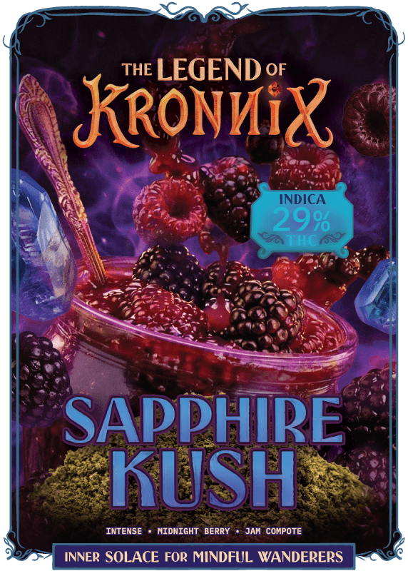
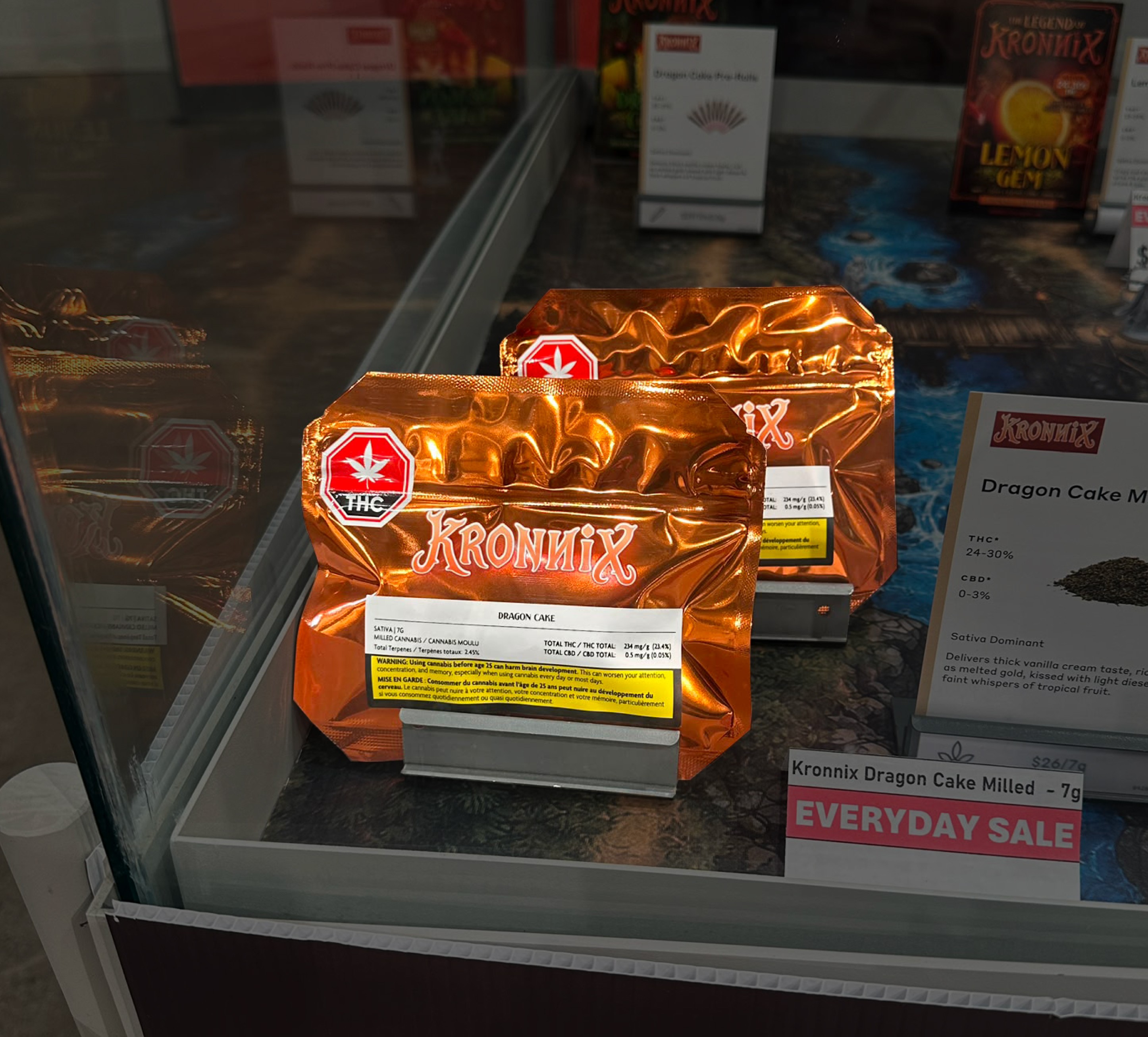
The logo as a system utilizes negative space around the wordmark to anchor tertiary text into one singular element.
The result is a robust visual suite with tons of attitude that can expand and contract, scale up or down, and be reimagined in countless ways for a brand that will continue to evolve and expand into new markets.

Each tagline was hand drawn for campaign creative, with new collections taking on a distinctive visual style from existing worlds in the brand.


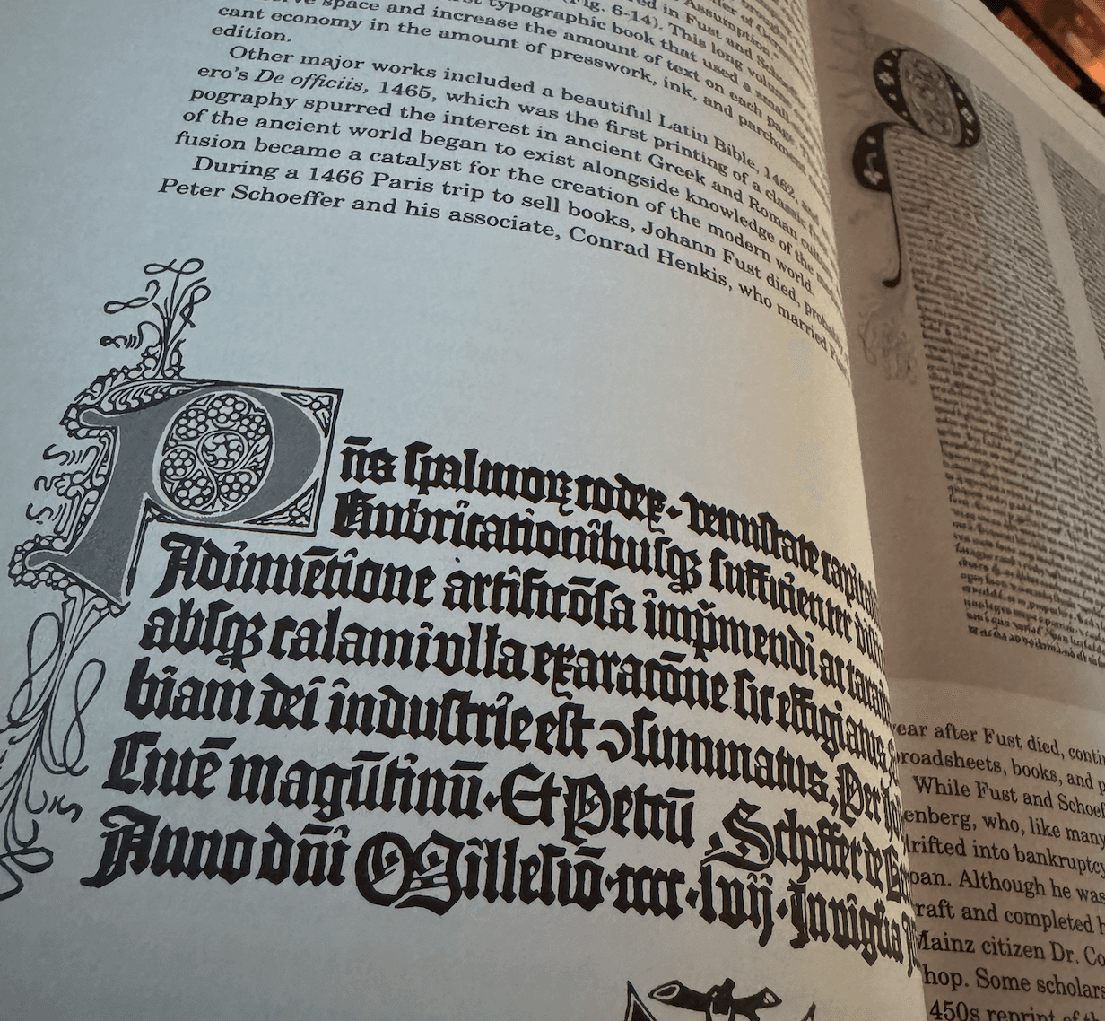
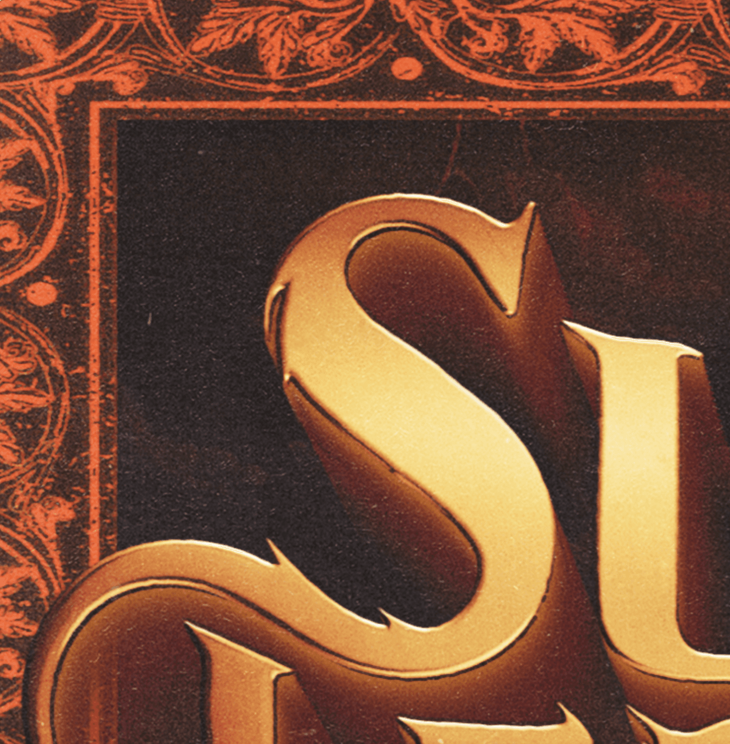
From project research, I thought I would referencing period art pieces but often found their frames to be equally if not more fascinating.
This helped shape the idea of the frame as
a portal, moving from the existing
world into something new.

Supporting elements were created from the geometry found within the wordmark. I'm a fan of the Punk concept of doing a lot with as few tools as possible. Reuse and recycle, especially your signature styles.


S



❦༺❦༺❦༺❦༺❦༺❦༺❦༺❦༺❦༺❦༺❦༺❦༺❦༺❦༺❦༺❦
The client wanted a new brand to appeal to a younger audience than their existing audience. No name. No strategy. This meant blue sky for creative ideas. The team I worked with developed the brand identity and two product collections over a span of 9 calendar months. I was brought on the project for visual identity and packaging art direction.
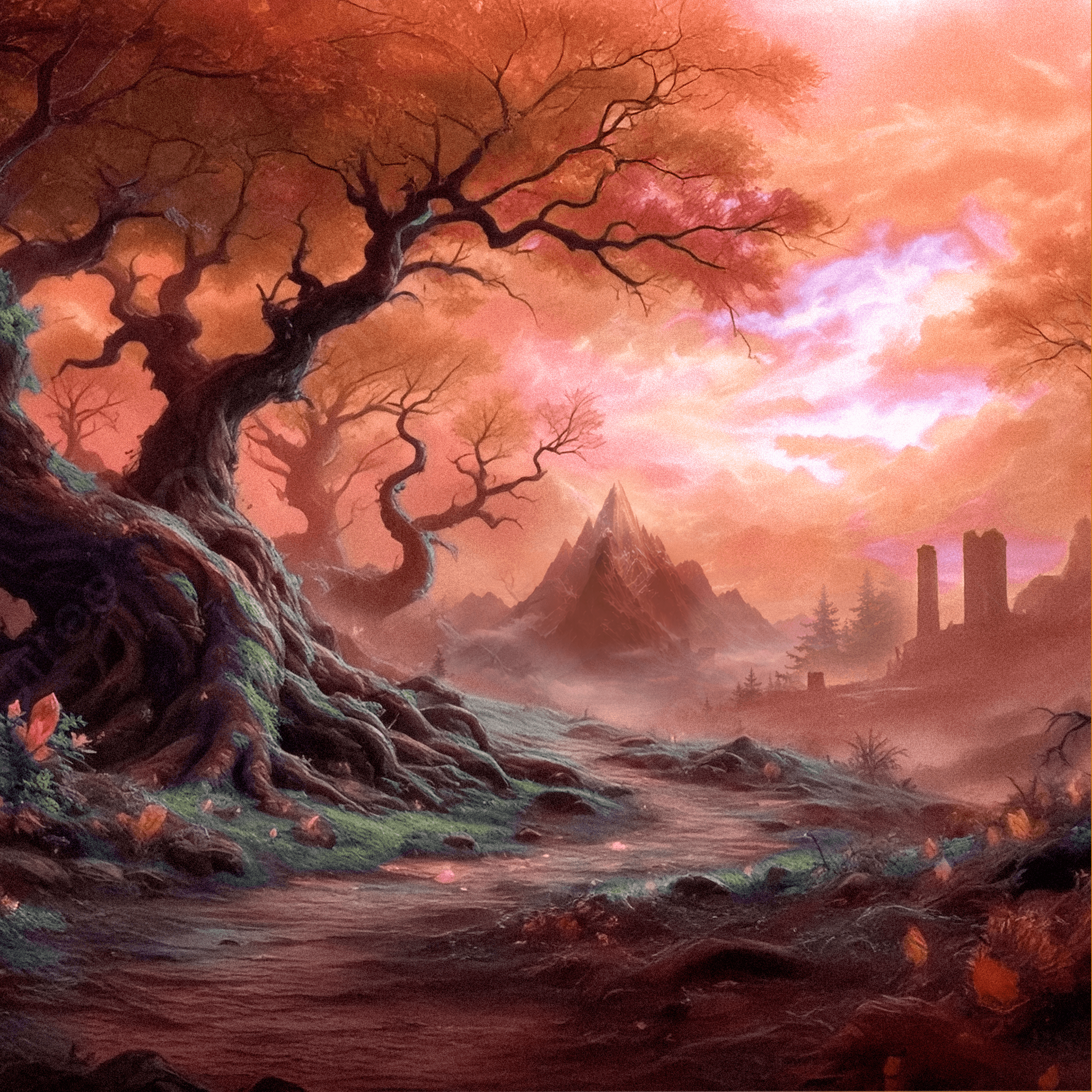
Even when people know it's fantasy, I wanted forms and shape to be inspired by real-life physics and materials, a feel of having actual weight and permanence.
Re: logo suite, it was important that the wordmark had a place in historical reality; representing a duality of organic geometry and wrought iron styling. The final results took quite a few rounds of revisions with the overall team to achieve but the results are really well weighted, comfortable at a compact or expansive size, all while retaining a Jim Henson-level of whimsy.
Creative & Art Direction: Emily Kalatzis, Strategy/Copywriting: Miranda Ballyntine,
Art Direction/Design Lead: Millan Butler, Digital: Donald Zhu,
Supporting Illustrations/Production Artist: Teagan Ruttimann
MILLAN BUTLER
GRAPHIC SOLUTIONS
2026 © ALL RIGHTS RESERVED
PARKDALE, TKARONTO, CANADA
THIS SITE WAS MADE WITH 0% AI
