SAIGON DRIP
A visual identity and packaging system for
a brand looking for their voice.
STRATEGY—ART DIRECTION — PACKAGING


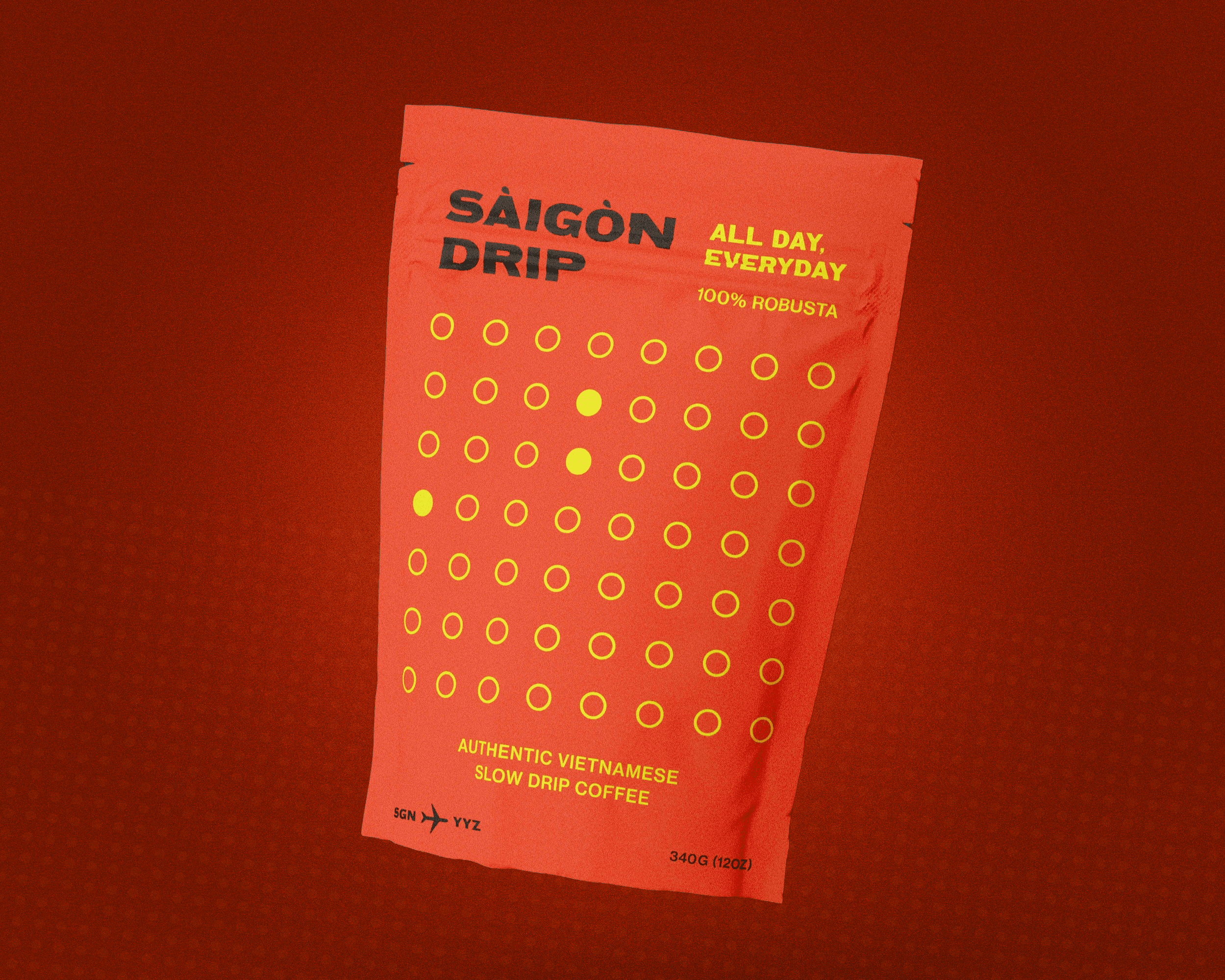





As part of the brand launch, I worked with the team
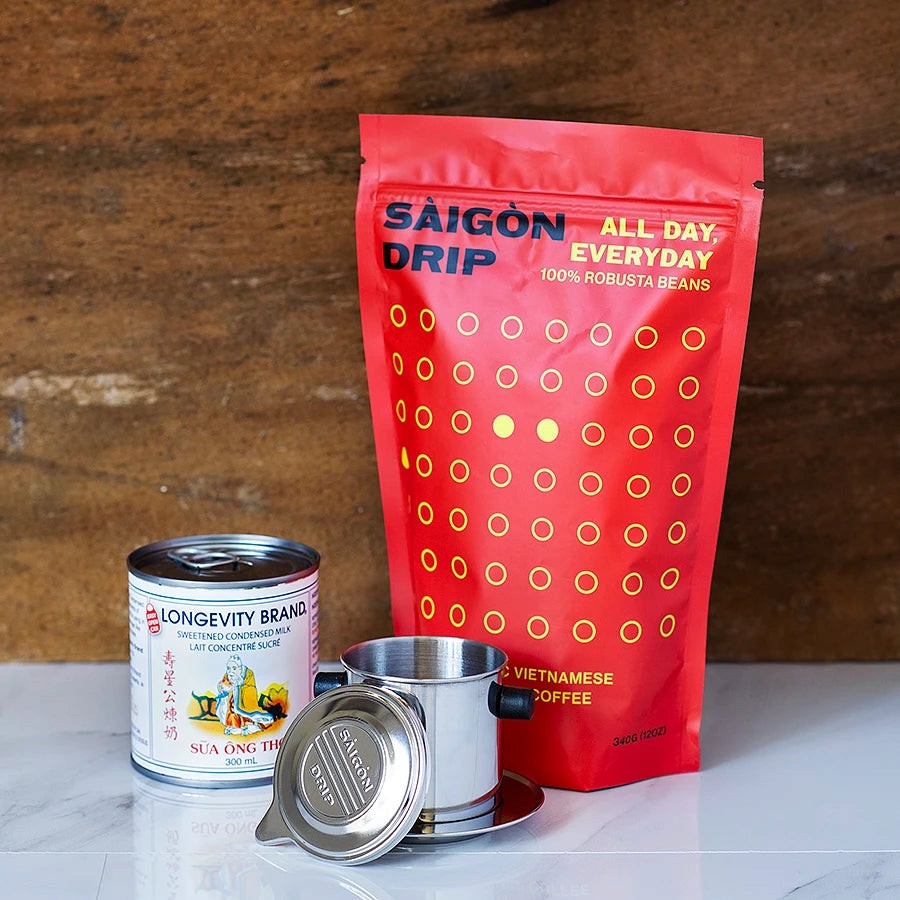
to develop an influencer kit including packaging, print materials
and a special version of the logo embossed across phin coffee filters.
Pls watch a short u.g.c. reel below to view the final results.


Working directly with the team, we kicked off the process discussing brand and packaging expectations, workshopping creative strategy and directions before I worked towards three visually strong concepts for the brand new brand.
Vietnam, where robusta beans are grown, has tons of culture in rural farming communities, art, and architecture that's been mostly lost from devastation of multiple colonizations throughout the country's history. This paralleled the robusta beans, which have been grown in Vietnamese provinces for centuries but declining in recent decades to arabica beans (which is what you find from any mainstream roaster).
Research included what coffee drinkers expected a robusta bean brand to look like, Because the beans make for a more caffeinated coffee, it's stronger and smokier in flavour. With the brand having so much pride for coffee, I pitched the concept of a packaging system that was as bold as the beans themselves.
A written manifesto was the result coming out of a 2-week creative strategy sprint. A reason for the brand to exist in the market with confidence, unapologetically true to their roots, bridging two communities together, rural to suburban. This tool shaped the company’s brand look and tone.
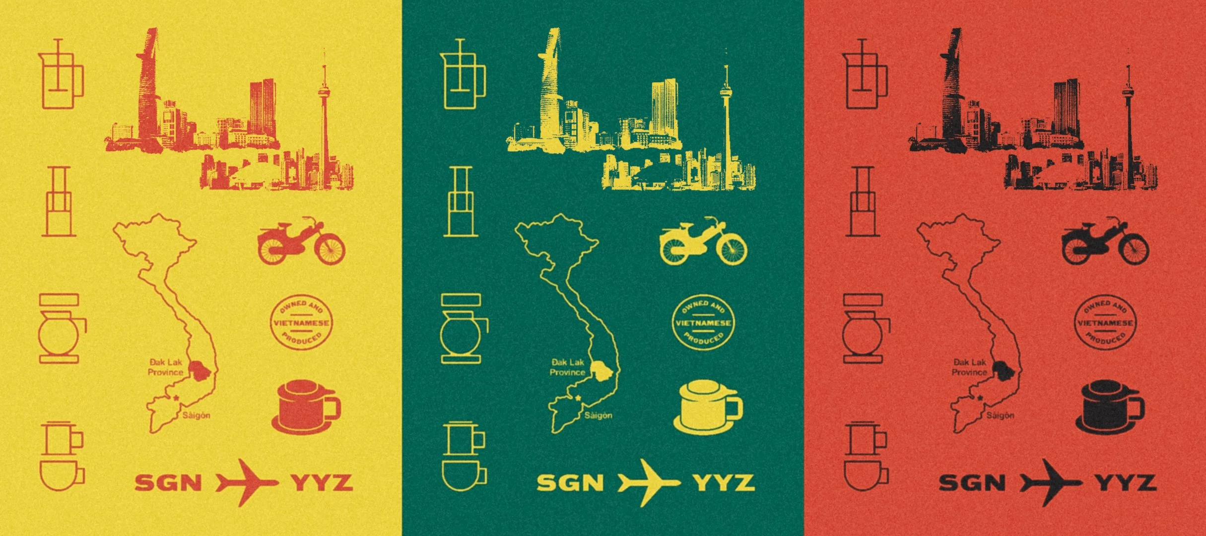
The visual design system and packaging, from the geometry to final colour palette, was inspired by
traditional woodblock printing, hand-painted street signs in downtown Saigon and folk art of the working farmers in off-seasons. Two cultures presented across the same bag,
Because the art inspiring it originated from rural farming communities, an artistic constraint introduced to the packaging system and identity was the idea that any part of it should be able to be recreated within a day or two using traditional printmaking methods.
Over the course of the project, I worked with the team to develop a visual system that could be expanded across future product launches and marketing channels for long-term growth. All based on a single,
easy to understand design language. The results have been national media attention,
a recognizable brand identity on shelves and a cult following of loyal customers.
Ultimately the logo and system we built stands the test of time, helping set the brand and category apart. The owners were thrilled with the results from the process to the final results, and it made some news in local news and social.
Due to project conflicts, I unfortunately wasn't able to continue working on the brand beyond their first product launch. If working on it again today, I would redo the front of the bags as I was never a huge fan of the left and right aligned logo text in two different sizes across the same space. Additionally, I would actually make the packaging physically from printmaking methods and later digitizing them for print. Otherwise after a few years out in the world, I'm still incredibly proud with the results we achieved starting with a brand that was just a name and a brief on a slide, to seeing the product being enjoyed around the city and beyond.
MILLAN BUTLER
GRAPHIC SOLUTIONS
2026 © ALL RIGHTS RESERVED
PARKDALE, TKARONTO, CANADA
THIS SITE WAS MADE WITH 0% AI
